- What is a Micro-Interaction?
- Top Examples of Ecommerce Websites Using Micro-Interactions
- Why Online Stores Are Using Micro-Interactions For Higher Sales
- Common Micro-Interactions Used in Ecommerce Web Design
- Types of Micro-Interactions You Can Use in Your Ecommerce Web Design
- Common Mistakes to Avoid When Using Micro-Interactions in an Ecommerce Website
- Webskitters Ltd.- Enabling Key Web Design Solutions
What makes details so powerful? It may sound strange, but the smallest touches often decide whether someone enjoys using a website or abandons it. Within ecommerce web design, micro-interactions are those discreet details.
These features guide people, reassure them, and sometimes even make them smile.
If you have ever added something to your online cart and seen a quick bounce effect, that’s a micro-interaction at work.
The whole point of this web design approach is to make the digital space feel more alive and more human.
According to Forrester, companies that improve customer experience can increase revenue by 3.5X, and micro-interactions are one of the tools helping that happen.
This is one reason why a web design agency in London has started focusing heavily on micro-interactions as part of delivering an enhanced user experience.
What is a Micro-Interaction?
A micro-interaction is a small, contained moment that happens within a digital product.
It could be as simple as a button changing colour when you hover over it or a smooth animation that confirms your action when you submit a form.
When you think about it, the important part is not the size of the feature but how it affects the person using it.
No one really pays much attention to tiny moments like this because they just blend into the flow of a website. But the fact is that they are making the online shopping experience feel so natural and intuitive.
Any user who clicks “add to cart” and sees nothing happen will be annoyed. They might wonder if the click worked at all. But, if the cart icon shakes or a number updates instantly, the user feels reassured.
That’s why micro-interactions exist, not to take centre stage, but to quietly improve confidence and enjoyment while browsing online.
The Parts of a Micro-Interaction
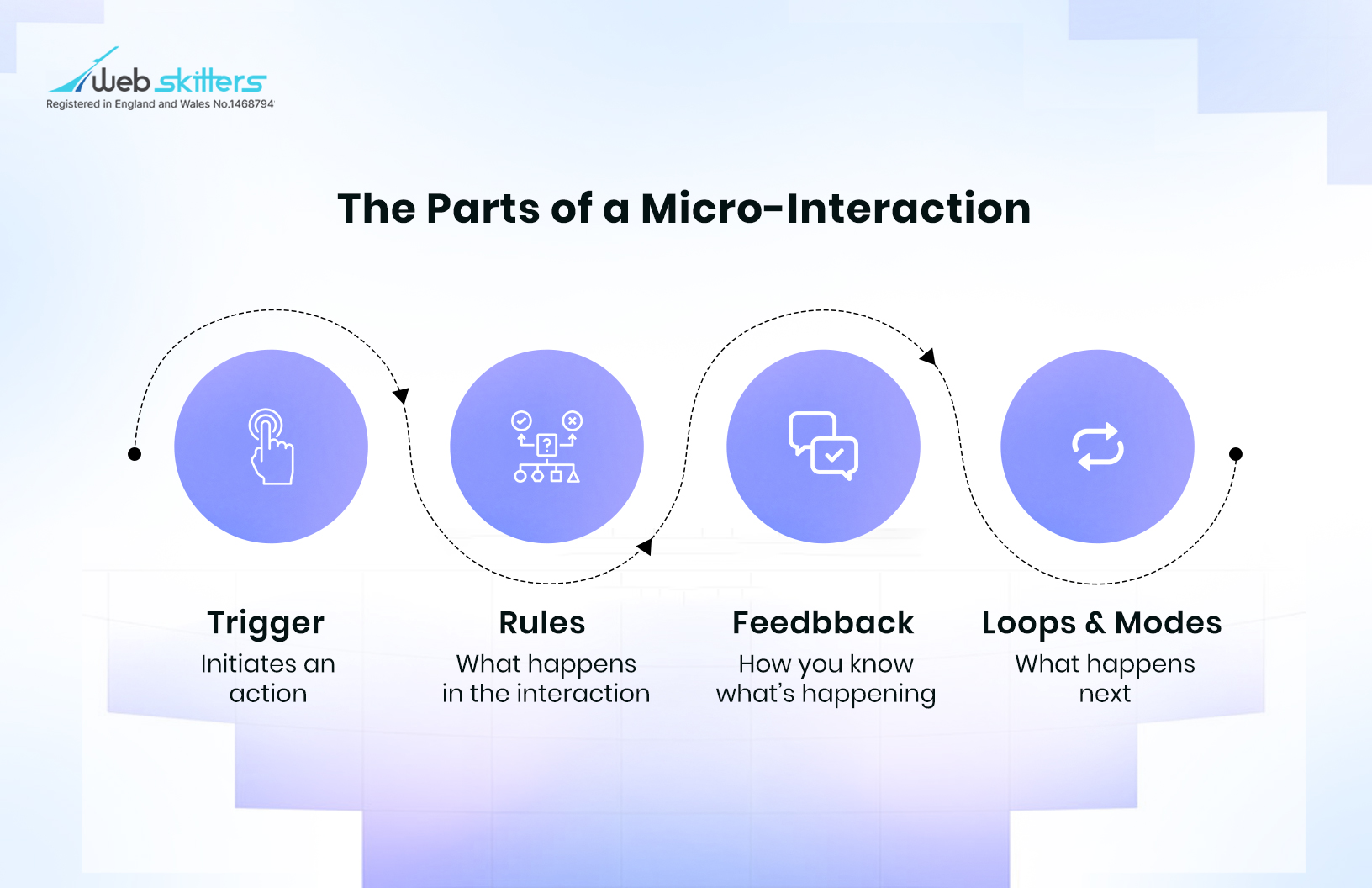
Every micro-interaction has four parts, which you, the user, may not always notice.
Together, they are able to create a complete experience, even though the user may only experience the final effect.
- Trigger: This is the starting point. It is the initial click, a tap, a hover, or even an automatic system response like receiving a message.
- Rules: Here, we have the background instructions of code that determine what happens once the trigger is in play. So, pinching on an image can make it zoom in, while clicking a heart icon may turn it red.
- Feedback: There needs to be a visible or audible cue to these online interactions, which is called feedback. It could be a colour change, a sound, or a small movement on the screen that reassures the user their action worked.
- Loops and Modes: These define what happens over time or with repetition. A notification badge that grows as messages increase is a loop, while switching between light and dark mode is a mode.
Top Examples of Ecommerce Websites Using Micro-Interactions
To give you a better idea of this feature, let’s see how top brands around the globe are using micro-interaction in their ecommerce web design.
1. IKEA
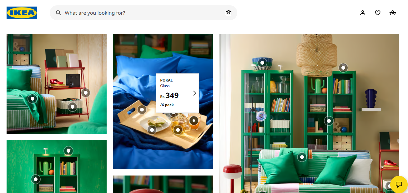
IKEA’s living room and bedroom collections have micro interactions in the form of a hover effect. If you hover over any item in the displayed collections, you get quick details about it.
You wouldn’t even have to open a new page.
Browsing through these collections saves time and feels effortless for shoppers.
Just moving the cursor over an item they like is giving them all the basic information they need to decide whether they want buy the product or not.
It’s as simple as that.
2. H&M
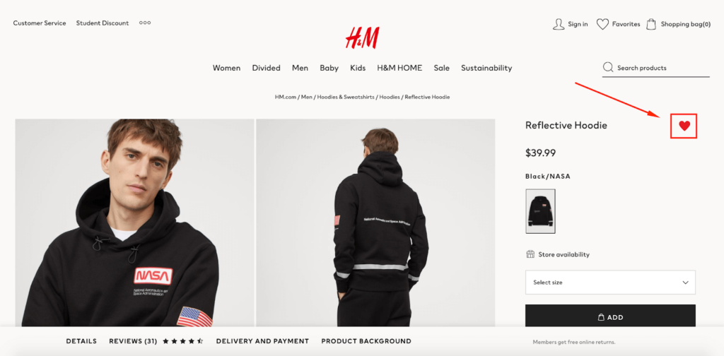
On H&M’s ecommerce store, shoppers can favorite or “like” a product that they plan to buy later by clicking on a heart icon, which then turns red.
This serves as instant feedback, telling the customer their action has been saved.
Furthermore, this gives them a curated list of their favorite products that they can access in one tab.
Since shoppers have a positive experience with this micro-reaction, they tend to make more purchases as a result.
3. Amazon
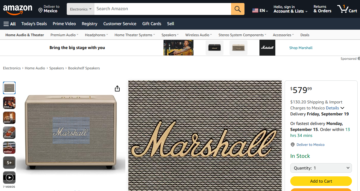
The ecommerce giant Amazon, has several micro-interactions that customers would find engaging.
Their hover-to-zoom feature only requires shoppers to place the cursor above the item.
This is vital when shoppers want to check the item more closely to be confident in their purchase.
Customers become much more convinced to make a purchase once they have seen the product’s finer details, texture, and other specifications.
Why Online Stores Are Using Micro-Interactions For Higher Sales
There is no denying the cutthroat competition when it comes to online shopping.
This is enough reason for store owners to ensure that their ecommerce web design is extremely customer-friendly.
Let’s look at why providers of web design in London implement smart micro-interactions within ecommerce stores.
1. Building Confidence
When someone adds a product to the cart and sees no change, doubt creeps in.
Did the click work? Should they try again?
A small shake of the cart icon or a number update instantly removes that uncertainty. Confidence grows when shoppers know every action is registered.
2. Creating Clarity
Ever gone on an online store and felt overloaded with choices?
The good thing about micro-interactions is that it can bring order to chaos. This works by highlighting clickable areas or showing hover states.
As a user, you would not even realise that these subtle cues are removing confusion and making navigation nice and smooth.
3. Boosting Engagement
A lively interface would definitely hold an online shoppers attention longer than a static one.
Those tiny touches (buttons that respond to hovering or sliders that glide smoothly) make browsing feel almost cathartic.
The more pleasant the interaction, the more likely someone is to keep exploring.
4. Adding Delight
Anyone who has visited the Apple store will know the delightful experience it offers.
Ecommerce stores can afford to add a playful bounce here, a gentle sound there, creating charming yet helpful moments for shoppers in the middle of busy lives.
When people enjoy the process, they are more likely to return.
5. Supporting Conversions
Every online store wants shoppers to complete purchases. Micro-interactions play a role here as well.
Progress indicators during checkout reduce hesitation, and instant product updates prevent frustration.
By keeping people informed and reassured, stores lower the risk of cart abandonment.
While these reasons may be compelling, it’s also worth remembering a small caution. Micro-interactions need to be tested. What one audience appreciates could feel distracting for another. Through web design services, you can carefully test these features to ensure they truly improve the experience.
Common Micro-Interactions Used in Ecommerce Web Design
|
Page |
Micro-Interaction Example |
Purpose |
|
Homepage |
Hover effects on featured products |
Encourages exploration and shows clickable areas |
|
Category Page |
Smooth transitions when filtering items |
Keeps browsing smooth and reduces friction |
|
Product Page |
Instant image updates when selecting variations |
Builds trust and encourages experimentation |
|
Cart Page |
Quick animation when adding items |
Confirms action and reassures the shopper |
|
Checkout Page |
Progress indicator animations |
Reduces uncertainty and lowers drop-off rates |
|
Search Results |
Highlighted text as results load |
Provides feedback that the search is working |
|
Wishlist Page |
Heart icon fills with animation when clicked |
Adds emotional satisfaction to saving items |
|
Confirmation |
Playful checkmark animation on order completion |
Ends the journey with a sense of accomplishment |
Types of Micro-Interactions You Can Use in Your Ecommerce Web Design
There are several small but helpful features that you can avail via web design services. These have proven to make the shopping process more enjoyable for online customers.
1. Hover Effects
Hover effects are one of the most common micro-interactions.
When you move your mouse over a product, something changes, a shadow appears, the image brightens, or quick details pop up.
ASOS, the fashion brand, lets you see a second image of a product even without clicking.
It saves time and keeps you moving through the collection with less effort. That one small change makes browsing addictive because you can compare faster.
2. Button Animations
Buttons are clicked hundreds of times during a single shopping session, so they obviously need to respond instantly.
The well-known “Add to Cart” button on Amazon is quite intuitive.
The cart icon updates with a number right away. It is that animation that tells you your click worked. Without it, you would probably keep pressing or feel unsure. The animation is simple, but it removes hesitation.
3. Loading Indicators
Do you enjoy staring at a blank screen? No one does. A loading spinner or a progress bar makes the wait bearable.
If you go to Sephora’s site and apply filters to narrow down products, you will notice a subtle loader.
This tells you that the site is processing. That reassurance keeps you from refreshing or leaving. In fact, the pause feels shorter because you are kept informed.
4. Form Validation Feedback
Most shoppers find checkout forms frustrating to fill. But you can lighten the burden by offering them real-time feedback.
If someone types their email ID and instantly sees a small green tick when it’s valid, they are more likely to carry on.
This works even for errors. A form field that jiggles when an error is entered will alert the shopper and save them from having to resubmit the entire form.
5. Image Transitions
When shoppers choose between various colours or styles, they expect instant image updates on product pages.
Adidas’ online store does this well. If the shopper clicks on the red hoodie option instead of a black one, the photo changes immediately.
That immediate colour swap makes the process engaging and avoids the annoying feeling of clicking through several different product pages.
You can see the product you want straight away without interruption.6. Notifications and Alerts
6. Notifications and Alerts
There are certain subtle alerts that can streamline the purchase process for shoppers.
When you see a small badge appearing on the cart or a pop-up saying “Item added,” it gives you visual confirmation that your action has been registered.
Have you seen Best Buy’s quick side-panel cart? What it does is slide in with your product after you add it to the cart.
The interaction is smooth, so there’s no confusion about where the item went.
These alerts are practical, sure, but they also make the site feel responsive and alive.
7. Progress Indicators
During checkout, people want to know how far they are from completing their purchase.
A progress bar that moves step by step can reduce stress.
Walmart’s online checkout uses a simple three-step progress indicator. It tells shoppers exactly what’s left, no guessing, no frustration.
That transparency keeps them moving toward the purchase.
8. Success and Completion Animations
The final moment in a shopping journey deserves attention. A playful checkmark, a confetti burst, or a smooth confirmation message closes the loop.
Etsy (a well-known marketplace for unique and creative products) does this so well with a friendly confirmation page once the order goes through.
It leaves customers with a positive final impression, which is often what they remember most.
True, if you consider each of these interactions on their own, they may sound insignificant. But together, they have the capacity to transform the shopping experience for customers.
The unfortunate part is that there are several mistakes that stores keep making when trying to use micro-interactions. Let’s look into them.
Common Mistakes to Avoid When Using Micro-Interactions in an Ecommerce Website
1. Overdoing It
How would you feel if you landed on a site where every button bounces, every product gets highlighted when hovered on, and the cart shakes wildly whenever you add an item?
Instead of helping, these effects feel like noise. Shoppers get tired and may leave altogether. Subtlety is the key here.
2. Slowing Things Down
If someone attempts to add an item to their cart, but the animation takes several seconds to play, it may cause issues.
What should feel instant actually becomes irritating.
Heavy animations can slow down a site, making customers quite impatient.
A delay that small might not sound serious, but it’s enough to push someone to a faster competitor of yours.
3. Inconsistent Design
Inconsistency increases user frustration.
If a shopper clicks a button on the homepage of your store and it glows blue, but then they go to the product page and they encounter slider buttons instead.
When micro-interactions are not consistent, users cannot predict what will happen.
Like it or not, predictability is part of trust.
4. Forgetting Accessibility
Think about someone who is colour-blind using a site where the only sign of a successful action is a colour change.
They would not even realise whether their input worked or not.
Or maybe imagine someone using a screen reader who never hears the notification that their item was added to the cart.
Designing without accessibility in mind leaves people out, and this can be avoided with a few simple adjustments.
The truth is, mistakes happen when micro-interaction designs are implemented without a well-thought out plan. Careful design and testing on a web designer’s part, keeps them from becoming obstacles instead of helpers.
Webskitters Ltd.- Enabling Key Web Design Solutions
The value of micro-interactions lies in how natural they feel. The best ones do not demand attention; they simply guide and reassure.
If you have ever enjoyed a smooth checkout or felt a small sense of relief when a button confirmed your action, you’ve experienced their impact.
The team at Webskitters understands that enhanced digital experiences can significantly boost conversion rates for online stores.
That alone makes micro-interactions worth the effort.
It is proof that little things shape big outcomes, especially in ecommerce, where trust and comfort decide whether someone buys or walks away.
Talk to our ecommerce web design experts to upgrade the user experience of your online store and enable considerably higher sales.

