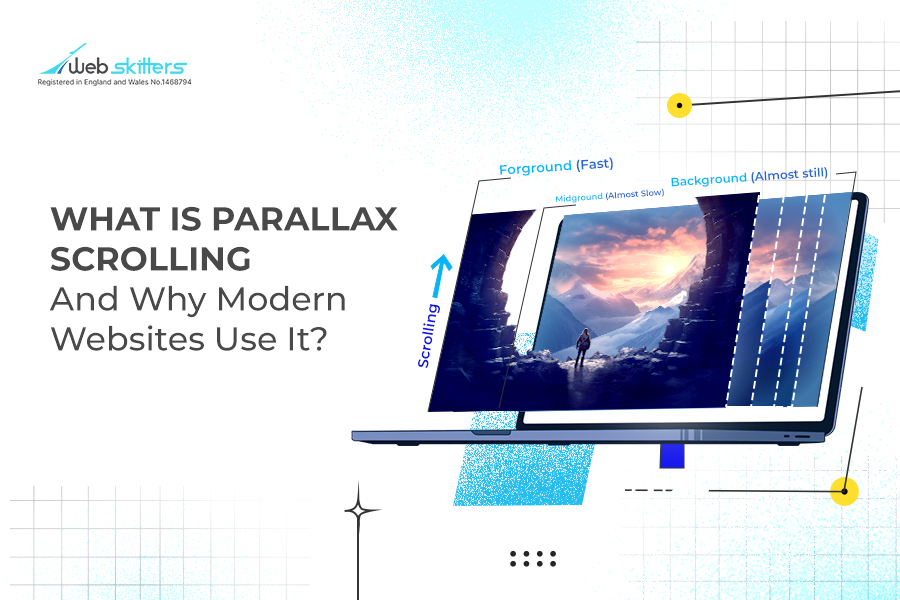
In web design, ‘parallax scrolling’ is a technique where the foreground elements of a website move faster than the background, creating the illusion of 3D depth.
Have you come across a website that looks 3-dimensional? By just scrolling through the site you notice that the background content remains still or barely moves, while elements in the foreground zip by fast and may even zoom in as if it is about to burst through your screen? You have stumbled upon a parallax scrolling, a stunning technique that encourages visitors to stay on your website.
Believe it or not, this goes way back. Disney used multiplane cameras in the 1930s and ’40s, stacking different layers of animation to give everything a 3D feel. This was a pioneering technique, unlike anything done previously.
If you still didn’t get it, let’s break things down.
Imagine you are looking out of a moving car window and you see a long white fence speeding in front of you, and in the background, you see the hills drift by slowly. Parallax scrolling works the same on a website, backgrounds glide slowly while front content shoots ahead. That layered motion tricks your brain into feeling depth.
According to the top web design agency in London, this technique is popular among many big-name brands like Porche, NASA and Apple for a variety of reasons.
Why Modern Websites Use Parallax Scrolling
Let’s face it, most websites are boring. But, if you can turn a plain scroll on your site into a kind of mini-adventure, it invites people to linger and discover.
1. Story-driven Branding
Layered motion lets you reveal a brand story piece by piece, like turning pages in a vivid book. Check out the captivating website of The TinyPod, to get a better idea. In true storytelling form, each scroll brings a new chapter, text, images, and animation. They all move at their own pace and sometimes in different directions as well. It’s the part-by-part reveal that keeps visitors engaged, makes them pause to look closer, interested in the journey unfolding before them.
2. Spotlight on Product Features
Planning a product reveal to impress potential buyers? Parallax lets you pop each feature forward, literally. As users scroll, one detail zooms in, then fades, making even small product specs feel cinematic. It elevates ordinary features into focal moments.
3. Emotional Engagement for Campaigns
When you’re running a campaign or launching something new, you want users to feel it, not just see it. Parallax can layer in emotional visuals, be it bold imagery, mood-setting colors or even subtle motion, taking your senses on a roller-coaster as you scroll. Pure storytelling through movement.
4. Breaks Up Long-form Content
When you come across long blocks of text on a website, don’t you feel overwhelmed? The dynamic effect of parallax allows you to break it into short, visually appealing sections. Backgrounds shift slowly, text moves differently. The end result is that the visitor experiences natural pauses and focus points, which obviously makes reading easier and more interesting.
5. Memorability
A site that moves differently from others is more likely to stick in visitors’ memories. With thousands of generic websites populating the internet, it helps to have one that stands out from the rest. Visitors get the details they need with ease and also remain impressed with your brand.
6. Guides User Attention Flow
Your website visitors can be steered to look at certain places. How? Parallax helps direct their gaze. Foreground elements move first, drawing focus, then text or CTAs appear at just the right moment. This way your site leads their eye in the right place, instead of just hoping they notice and take the desired action.
Points to Remember While Using Parallax Scrolling
If you have decided to use parallax scrolling for your website, there are some things you should bear in mind.
Use It Sparingly
Scrolls that lead to much motion and smoothness are bound to be distracting or worse, may even cause dizziness. What works is if you restrict it to certain page zones, without implementing it throughout the site. That way, the ‘wow’ factor stays just enough, not overwhelming.
Compress Media Files
Everyone knows that heavy images on a website will cause it to load slowly. You lose the attention of your visitors. To compress the media you plan to use, run them through tools like TinyPNG or ImageOptim. Media files that are lighter will scroll more smoothly and quickly. This way, visitors won’t get frustrated and exit your site before the parallax even loads.
Partnering with a web design agency in London will ensure that the parallax animations and scrolling effect are done well, without compromising the visitor’s experience.
Use Appropriate Colours to Create Depth
Even the tones and colours create the 3D depth. It is found that darker, muted backdrops with sharp, bright foregrounds bring elements closer visually. Imagine that you are driving at night and are looking at the nearby road signs. You will observe that the signs seem to move rapidly, while the moon appears to follow you slowly. That contrast helps your brain sense depth even if it’s just scrolling.
Mind Accessibility
For some people, especially those with vestibular sensitivities, scrolling motion can feel unsettling. You can include a toggle that offers “Easy Mode”. And of course, test with accessibility guidelines like WCAG (Web Content Accessibility Guidelines) and inclusive design principles.
Impressive Examples of Parallax Scrolling
It’s better to see the effect with your own eyes, rather than reading about it. Take a look at some great examples of webpages that impress visitors with their use of the parallax effect.
1. Apple

On Apple’s AirPods Pro webpage, the parallax effect is almost movie-like. The earbuds and their case drift apart and reunite when you scroll, as if suspended in mid-air. The various components move at different speeds, giving a depth that makes the product appear three-dimensional.
2. Porsche
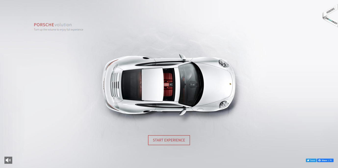
The Porsche’s Evolution page offers an interactive tour of its iconic car models. As you scroll down, each car pops up from various angles, as if you’re examining them in a sophisticated showroom. Parallax effect gives you a dynamic timeline, with smooth transitions that spotlight Porsche’s design evolution throughout the years.
3. NASA
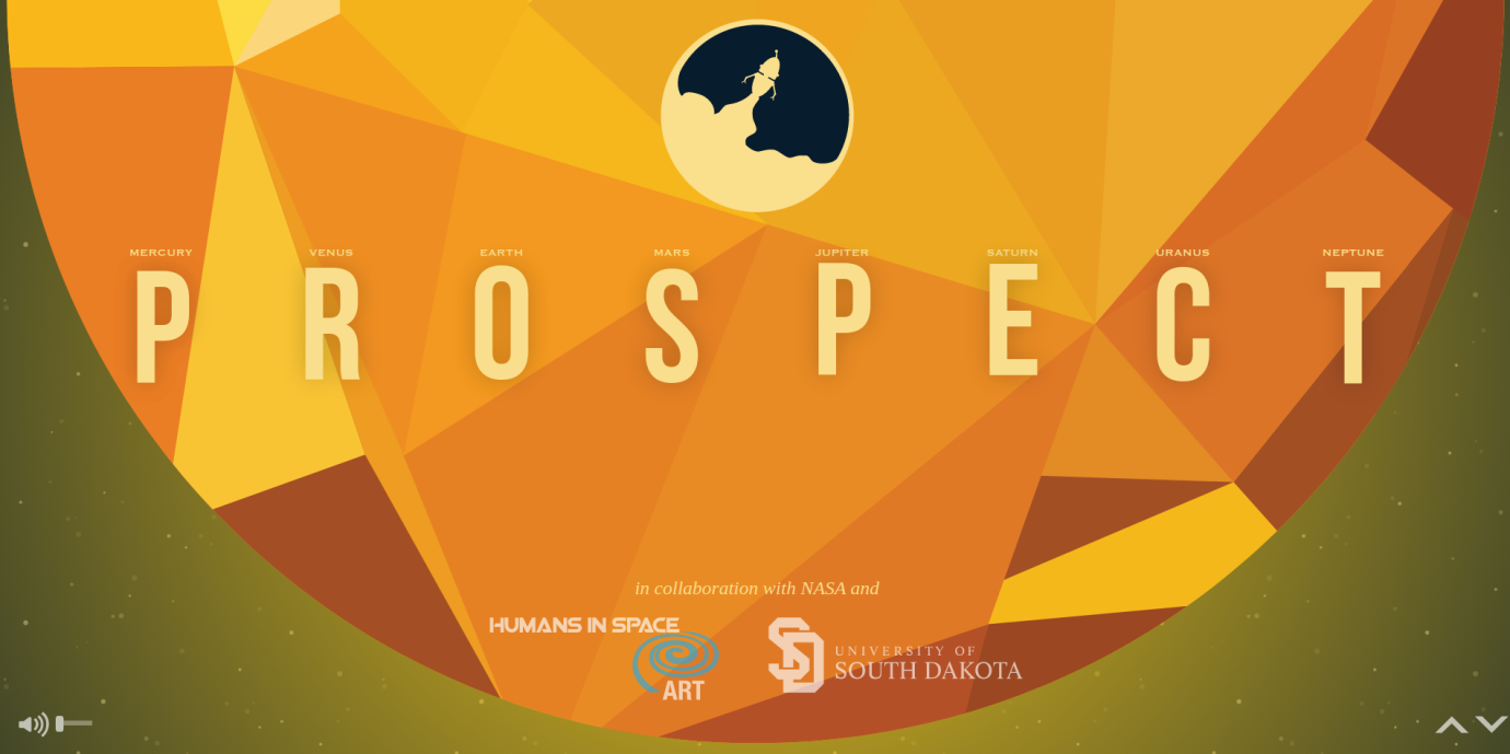
NASA Prospect introduces space exploration on your screen in a surprisingly exciting manner. When you land on the site, you are invited to turn up the volume and begin scrolling. A slow build of an astronaut against a big, starry background appears as you scroll. And before long, you’re sucked into a visual narrative where the character floats along with a robot through space landscapes.
4. Delassus Group
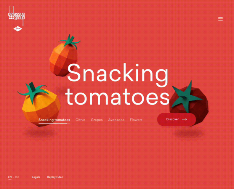
The horizontal parallax scrolling on the Delassus Group’s website is quite fun and engaging. The page scrolls are designed to display vibrant fruits. The 3D-looking fruits glide across the screen with a smooth, almost natural rhythm.
They have ensured the movements are very subtle and certainly not distracting. In fact, the storytelling effortlessly shows the brand’s commitment to quality and vitality.
5. TAG Heuer
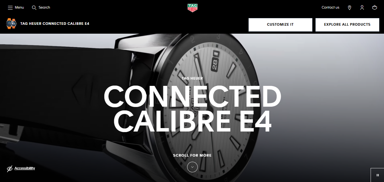
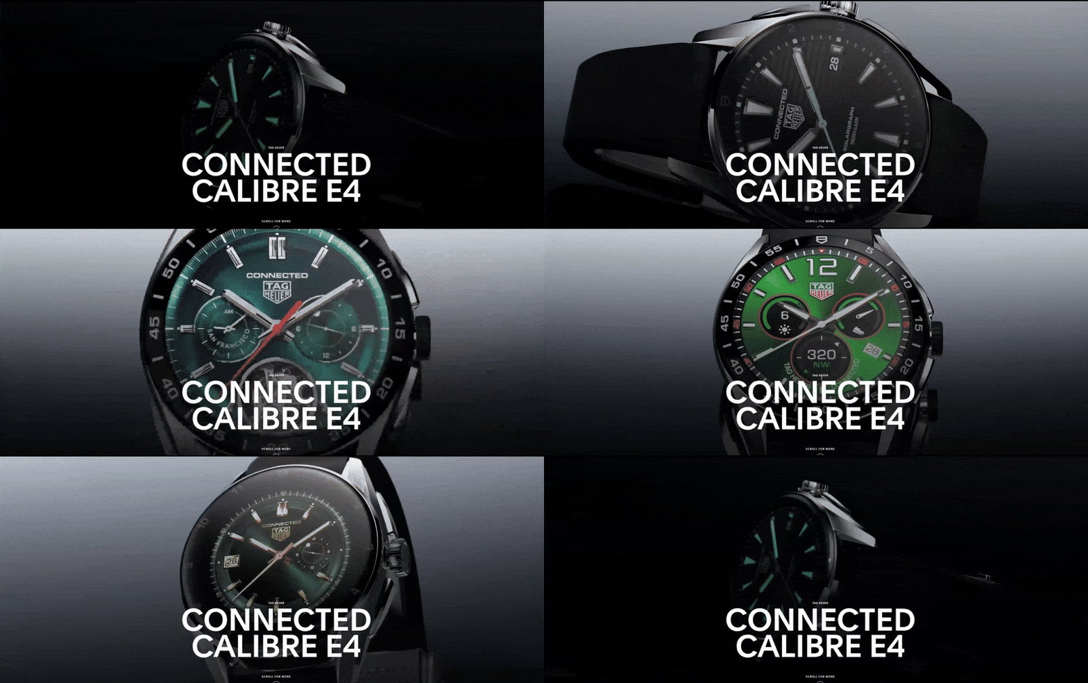
As soon as you arrive on TAG Heuer’s Connected Collection page, parallax transitions are applied among various watch designs and features. As you scroll through, watches slide into the view from various angles, enabling you to get a close-up look at their stylized details. With each scroll, slight movements are introduced that reveal the craftsmanship, and text descriptions are shown alongside to describe the features.
6. Recap After Use
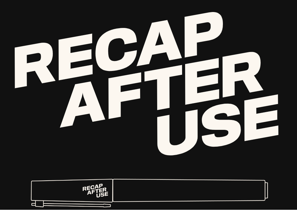
You can’t expect anything less than top-tier innovative design from a designer’s portfolio. And this site does not disappoint. The site begins with an uncap of the pen as you scroll, preparing you for a portfolio that literally “opens” before you.
Each design project is presented with parallax details, where images and outlines shift ever so slightly to create depth. Hovering adds an extra touch, filling out project details and engaging a sense of three-dimensionality.
Common Challenges of Using Parallax Scrolling in Your Website
We can all agree that for websites, ease of use should always come first. Sure, parallax scrolling can be thrilling, but it comes with a few practical concerns you will want to keep in mind.
1. Slow Load Time
A web page will drag if it is burdened by heavy visuals and layered scripts. You should take it for granted that your visitors are impatient and will quickly leave if a site does not load smoothly.
What would help is to reduce the image sizes, and probably also the weight of animations, and use web design techniques like lazy loading to ease the strain. Running a speed test through tools such as Google Lighthouse can also give you a clearer idea of where improvements are needed.
2. Lag and Freezes
It’s unreasonable to assume that all visitors to your website will be browsing on a top-end device with a fast connection. Maybe your site visitors are using older phones, or maybe they are on unstable networks.
In these cases, parallax scrolling can stutter or even freeze, which disrupts the experience. You could try testing the effect on a range of real devices, especially mobiles, to see how it performs. What can help is adjusting the motion speed or possibly offering a lighter version of the animation.
3. Bounce Rate Rises
Using the parallax effects in such a way that it overwhelms visitors can make them leave the site before they have even had a chance to go through the content. The fact is that people come to learn something or complete a task, not to be bombarded with distracting visuals. So, it would be a good idea to keep the scroll pace steady and the movement subtle.
The next time you check Google Analytics, see if your site’s bounce rate has spiked after adding parallax. If that’s the case, you might want to think about how that effect is being utilized. Gentle, well-timed motion can hold attention instead of pushing it away.
4. Confusing Navigation
So far we have confirmed that movement has the capacity to create depth, but if done poorly, it also tends to distract from the fundamentals, such as menus or important links. This can leave visitors unsure of where to go next. It would help to keep navigation clear, easy to spot, and separate from any dramatic scrolling scenes.
On long pages in particular, maintain a fixed or simple menu to give people a reliable anchor. You need navigation that feels obvious and straightforward if you expect visitors to stay and explore further.
Tools and Technologies Used in Parallax Scrolling
1. HTML5 & CSS3
When people talk about starting simple with parallax, HTML5 and CSS3 usually come up first. With nothing more than a background property, you can lock an image in place while everything else moves past it. It looks layered, feels smooth, and doesn’t demand extra scripts or setup.
2. JavaScript Libraries
- GSAP : If you want to go deeper, JavaScript libraries open up far more control. GSAP is the one developers lean on when they need precise animation. It lets you run fades, slides, or scaling effects right in step with the scroll.
- ScrollMagic : This tool was built for scroll-based storytelling. You can pin elements at certain points or trigger a transition the moment the user reaches it.
- Locomotive Scroll : Locomotive Scroll adds that momentum and polished flow modern sites are known for. Another good thing is that it supports parallax, lazy loading, and custom scroll behaviours.
3. Website Builders
- Webflow : For those not writing code, website builders make life easier. Webflow is a good example. There’s an option to assign layers, tweak how quickly each one moves, while checking the effect on the page in real time.
- Wix and Squarespace : These are two popular tools that make things easier for designers. How it works is, you pick the background as well as the effect, and the platform takes care of the rest, making them great for quick projects.
4. Design Software
- Figma : This design tool gives you room to map out how elements should shift or layer as someone scrolls. So, developers have a visual guide before coding begins.
- Adobe XD : This tool has some similarity to Figma, but with more powerful animation capabilities. It makes it simple to test and refine transitions, easing, and scroll flow until the concept feels right.
Final Thoughts
Other than the fact that it’s a treat for the eyes, research has proven that parallax scrolling can actually make people feel more connected to what they are seeing. This technique of blending movement artistically with the flow of information ensures that visitors are more willing to stick around and explore.
And if you’re looking for someone to build that kind of experience for you, we can help. As a reputable web design agency in London, Webskitters Ltd. focuses on keeping things simple for your users while still making your brand stand out. With your input, our web designers will develop a user-friendly website that feels natural and works as planned.
Get in touch with us to begin your project.
FAQ
1. Describe parallax scrolling in simple words.
Parallax scrolling is a web design technique. It is when the background of a website moves slower than the foreground while you scroll. It creates depth, almost like 3D, even though it is actually 2D. That same technique is used to make webpages more dynamic and fascinating.
2. Why do brands love using parallax scrolling?
Simply put, this technique makes people stay longer. Instead of scrolling through static content, parallax makes each section feel like a reveal. It helps tell a story step by step, which brands use to guide your focus and make their product moments feel cinematic.
3. Does parallax scrolling slow websites down?
It can if done carelessly. Heavy graphics and too much motion drag load times. Smart designers compress files, test on different devices, and keep effects subtle. When managed properly, parallax adds impact without hurting performance, so you still get smooth, fast browsing.
4. Is parallax scrolling smooth for mobile visitors?
Yes, but only if built thoughtfully. Phones aren’t as powerful as laptops, so cluttered motion can cause lag. Developers often simplify or adapt parallax on smaller screens so it feels smooth. That way, mobile visitors enjoy the experience without their device struggling.
5. How can a web design agency in London help?
Working with professionals means you don’t have to stress over the details. A good agency knows how to balance visuals with usability, so parallax feels purposeful rather than distracting. You’ll get a site that looks polished, runs smoothly, and keeps visitors engaged.

