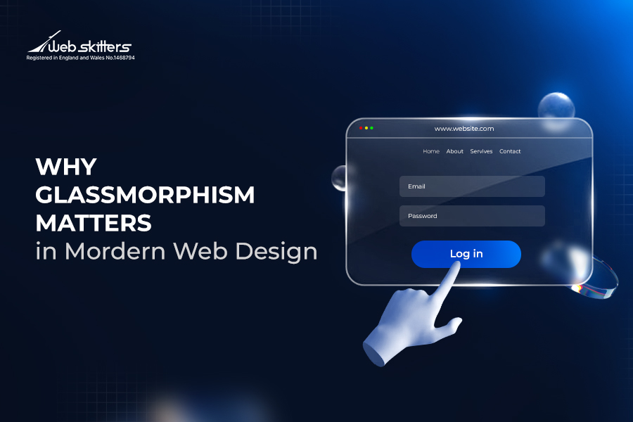
In 2025, Figma officially introduced Glassmorphism, which also made news during the release of the iOS 26 update. That’s how vital Glassmorphism is in modern web design.
The glass effect is now available in the Design and Draw modes. Plus, it can also be enabled in other Figma products.
But why are top design companies like Figma and Apple using Glassmorphism?
It is used because Glassmorphism provides a modern, sleek, and futuristic look to modern web pages. This way, user engagement skyrockets due to the aesthetic appeal.
What is Glassmorphism in modern web design?
Glassmorphism is a modern UI design style that uses translucent, glass-like layers to create depth and visual appeal. Popularized by Apple, it remains relevant today for its sleek aesthetics, though it can pose accessibility and performance challenges when overused.
Do you want to know more about Glassmorphism? Let’s explore its origin first!
The Origin of Glassmorphism
Suppose you go to a modern OS, website, or apps like MacOS or Microsoft Teams. Do you often encounter transparent panels, blurred backgrounds, and floating layers with subtle shadows?
That’s Glassmorphism for you!
Even if you haven’t come across the term, you’ve likely encountered the design numerous times.
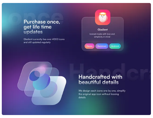
(Source: Dribble)
Let’s explore the formal definition.
What is Glassmorphism?
Glassmorphism is a design style that uses translucent layers to create contrast and depth between the front and back elements. All the elements mirror the glass texture.
This approach creates a UI that reveals context cautiously. It is done so that the background images or colours can peek through the panels, blurring the unimportant content.
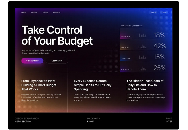
(Source: Dribble)
As you can see in the example above, Glassmorphism delivers a premium look and feel that enhances usability without creating much clutter or noise.
But, what’s the Origin? Let’s find out!
The Origin Story
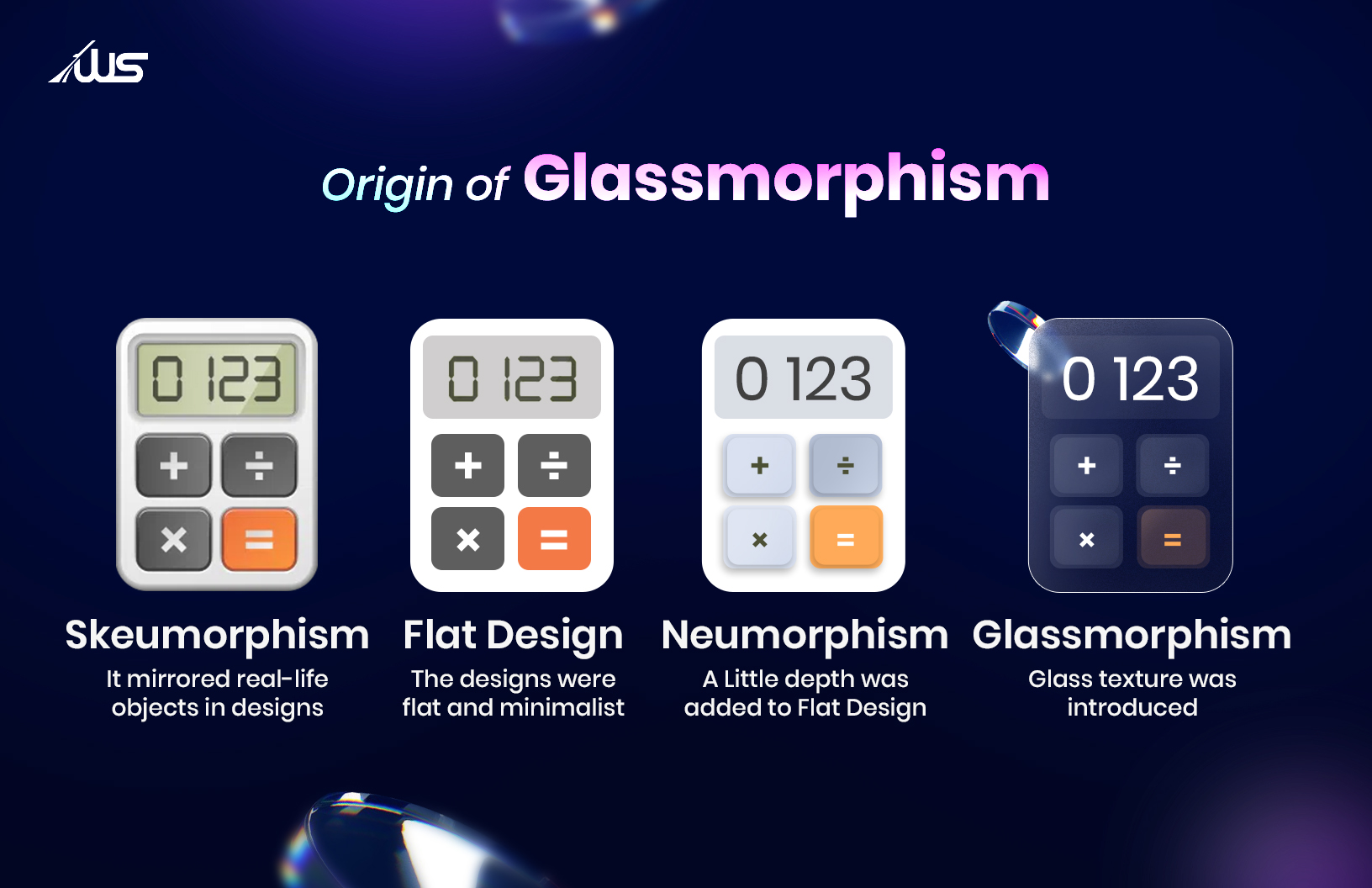
Glassmorphism didn’t just emerge out of the blue. It has its roots in Skeumorphism — a style that mimicked real-world textures in UIs. Skeumorphism was once pioneered by Apple.
Skeumorphism went out of style and was replaced by flat, minimal elements in later years. This gave rise to something known as Neumorphism, which added some depth to the flat designs.
This Neumorphic style was replaced by a transparent frosted glass texture that got popularised by the name Glassmorphism. Glassmorphism was again championed by Apple, followed by Microsoft in its Fluent Design System.
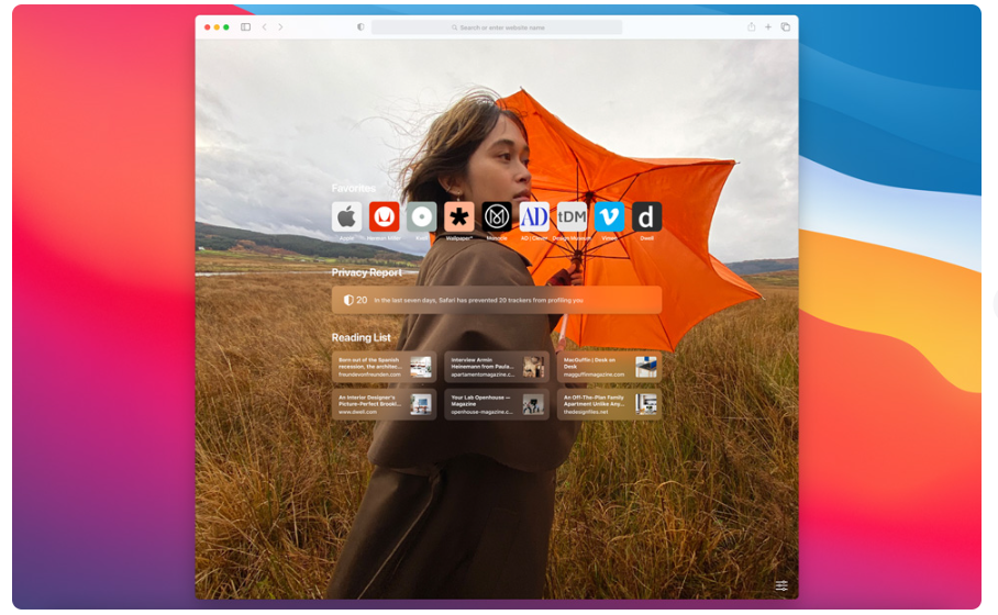
(Source: Apple Newsroom)
You can get a glimpse of early Glassmorphism in Apple’s macOS Big Sur and Microsoft’s Windows 11.
Is Glassmorphism outdated?
No, Glassmorphism isn’t outdated. It is thriving, and Apple has included it in its latest update. However, the recent iOS update (iOS 26) that brought Glassmorphism back into the limelight drew both admiration and controversy.
What was the iOS 26 update all about? Let’s explore that and more.
Why Glassmorphism Matters in Modern Web Design?
People often ask this.
Does Apple use Glassmorphism?
Yes, Apple uses Glassmorphism. So much so, it can be said that Apple popularised this design principle.
Moreover, Glassmorphism has always been Apple’s go-to design principle after Skeumorphism.
In 2025, Apple had a significant design update after decades. But this update is considered its riskiest design overhaul yet —and that, too, for pretty good reasons.
While many enjoyed the long-awaited iOS UI design update and loved the changes, the majority of Apple’s customers criticised it for usability and accessibility issues.
Users said that the update had readability issues and strained their eyes while using it.
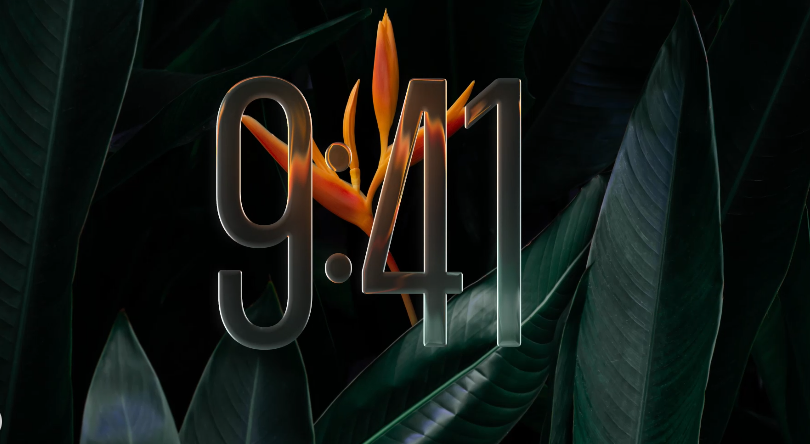
In the first Beta version of iOS 26 (iOS 26 Beta 1), Apple introduced Liquid Glass instead of Frosted Glass.
(Source: Apple Newsroom)
According to Apple’s official statement, Liquid Glass is a revolutionary change that mirrors real-life translucent glass. The texture’s colour is dependent on the surrounding elements. Most importantly, it can intelligently adapt to both light and dark environments.
Due to widespread dissatisfaction with Liquid Glass online, Apple released another Beta version (iOS 26.1 Beta 4) that gave customers the option to control the translucency.
This addressed the usability and readability issues Apple’s design faced.
So, Glassmorphism is still relevant; even thriving!
Now, another question arises.
Is UI/UX a dying field?
No, UI/UX is not a dying field. Unlike other design fields, UI/UX is ever-evolving.
Especially in the modern web design field, design styles are neither popular nor obsolete. What’s trending today can be extinct tomorrow, and vice versa.
But Glassmorphism has made its mark in modern web page design.
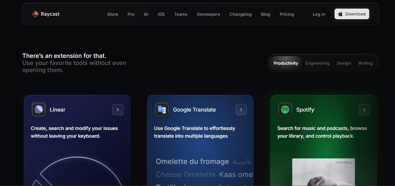
What are the top websites showing Glassmorphism design trends? Let’s look at some examples.

This is an example from Scale’s website.
(Source: Raycast)
Why Glassmorphism Matters in Modern Web Page Design?
Well, when we talk about Glassmorphism, versatility and aesthetics are the first things that come to mind. Versatility and aesthetics go a long way toward improving website user experience (Website UX).
According to Forbes, 94% of first impressions are influenced by website design. So, making your website beautiful and versatile is a priority.
In a way, Glassmorphism provides a perfect blend of usability and aesthetics.
Why use Glassmorphism in website design?
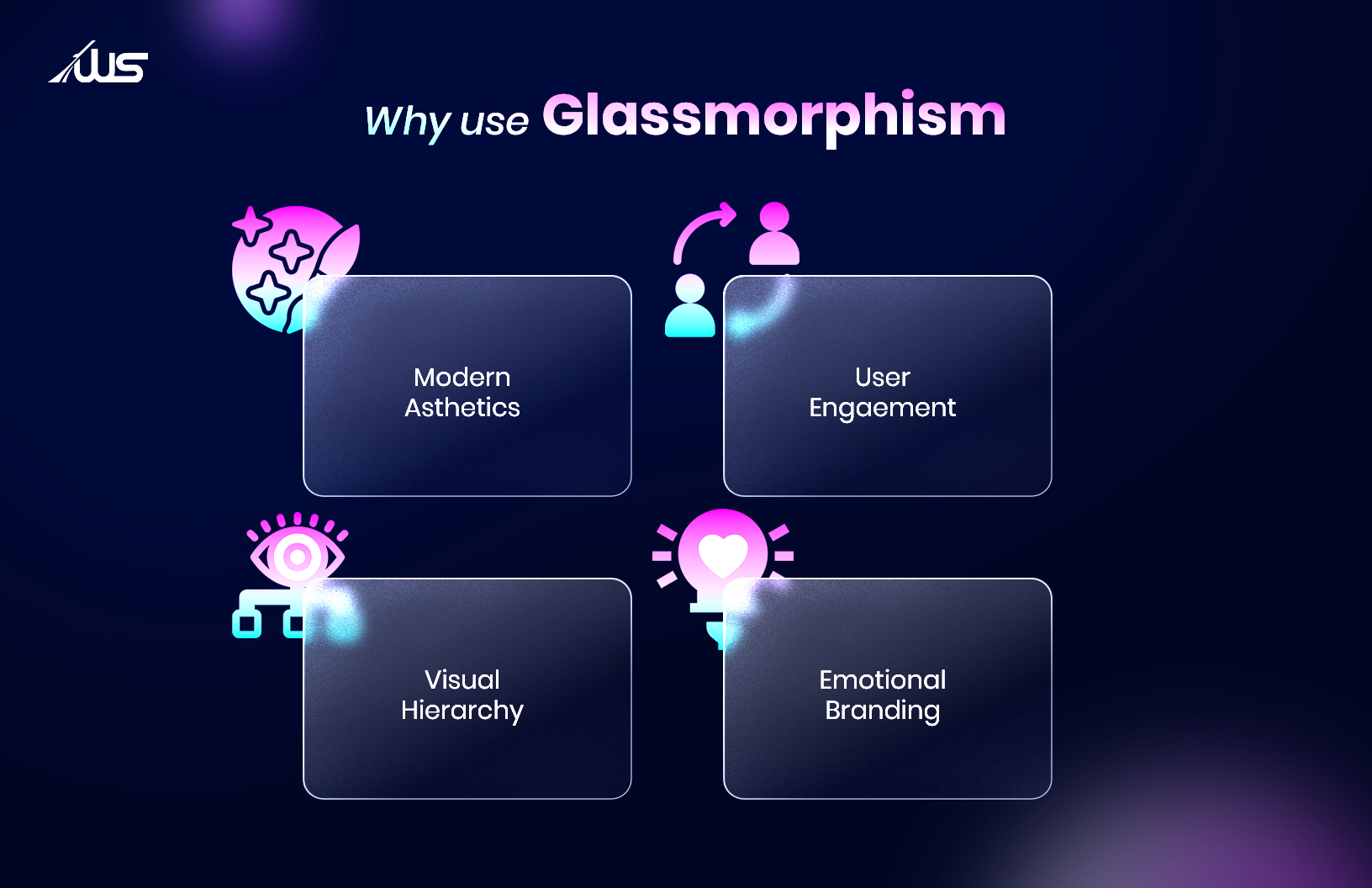
- Modern Aesthetics: The glass texture adds an eye-catching dimensionality and depth, making the website stand out.
- User Engagement: The dynamic feel makes the UI engaging and appealing.
- Enhanced Visual Hierarchy: It improves the website UX with a clear hierarchy, highlighting the key elements and allowing a smooth navigation in complex situations.
- Emotional Brand: The futuristic aesthetics enhance website UX, which enables businesses to establish a unique visual identity.
In a nutshell, Glassmorphism makes your website or web page design interactive and visually rich. This can substantially enhance the website UX and spur creative expressions.
But are there any challenges related to Glassmorphism? Let’s find out!
What are the Challenges of Glassmorphism?
In Glassmorphism, low contrast is your biggest enemy. Although this design style looks fresh, it can affect website accessibility if not executed properly.
With a low-contrast UI, text on the panel or card can vanish. And, colour blind or visually impaired people are the first victims of this. Also, for normal people, reading faint letters is quite tiring.
While Glassmorphism removes clutter and visual noise, using too much glass texture can create clutter. The subtle shadows, heavy blur, and faint outlines might confuse the users. This way, banners and buttons tend to blend together.
Apart from accessibility, another major Glassmorphism challenge is performance. The strong blur used in the design can strain the GPU, especially on phones with older software versions. The website may crash sometimes.
Dark mode is another enemy of Glassmorphism. What makes sense in light mode might not make as much sense in dark mode.
While most of these challenges can be tackled with proper execution, there are certain times when you cannot use Glassmorphism.
When You Should Not Use Glassmorphism?
Though Glassmorphism looks great, there are specific projects where you should always avoid it!
We can all agree that incorporating Glassmorphism in a website is beautiful. It substantially enhances the website UX. But there are situations in which you need to avoid it at all costs.
- If you are designing your site for old or low-end devices, Glassmorphism can make it slow. That’s because transparency and blur require more computational power to run in a smooth manner.
- Some websites need clear visuals. They may include maps or medical tools. Emergency websites need sharp details and stark contrast. So, in those sites, Glassmorphism can confuse users.
- Websites with a lot of content and information might also struggle with Glassmorphism. When the screen is full, blur can make text hard to read.
- Finally, every website has its own brand identity. Some brand identities don’t align with Glassmorphism. For instance, if your website is retro, technical, or industrial, the soft Glassmorphic look might not work.
Glassmorphism Is Great, Only If You Execute It Cleverly
Glassmorphism is the first step towards an immersive (layered) experience in UI. As AR, VR, and MR grow, depth and visual hierarchy will become increasingly important.
Glassmorphism will not only look beautiful but will also navigate users through 3D environments. For that, the designers had to evolve and experiment with ways to ensure accessibility without sacrificing it.
As the design trends evolve, modern web design will continue to grow. But it’s also essential to know where to use Glassmorphism and where to avoid it altogether.
When implemented correctly, Glassmorphism can be revolutionary for your website.
Do you want to learn more about the nitty-gritty of Glassmorphism and how you can implement it for your website? You can contact professional agencies specialising in minimalist web design, like Webskitters Ltd.
Book a call with us and create a website for your business that lets you stand out in the market.
FAQs
What is Glassmorphism?
Glassmorphism is a UI design style that uses translucent, glass-like layers to create depth and a modern, elegant look.
Who popularised Glassmorphism?
Apple popularized Glassmorphism through its macOS Big Sur and later refined it in iOS 26.
Is Glassmorphism outdated?
No, Glassmorphism is still widely used and continues to evolve in modern web and app design.
What are the main benefits of using Glassmorphism?
It enhances aesthetics, improves visual hierarchy, and makes interfaces more engaging and dynamic.
What are the challenges of using Glassmorphism?
It can cause readability issues, accessibility problems, and performance lags on low-end devices.

